Launched Lumen's First Design System
Background
As Lumen Technologies expanded its digital footprint across two brands and multiple platforms, the need to streamline design processes became evident.
Previously, designers worked off an outdated PDF guide and shared design files informally—resulting in inconsistent user interfaces and a fragmented user experience.
The goal was to create a unified, consistent experience at every customer touchpoint, reduce design and development cycles, and drive innovation.
Challenge
The primary challenge lies in the lack of UI consistency across products. Teams were working in silos without a central source of truth, leading to discrepancies in the user experience and increased maintenance efforts. With rapid growth, any design updates needed to be implemented swiftly and without disrupting the user journey.
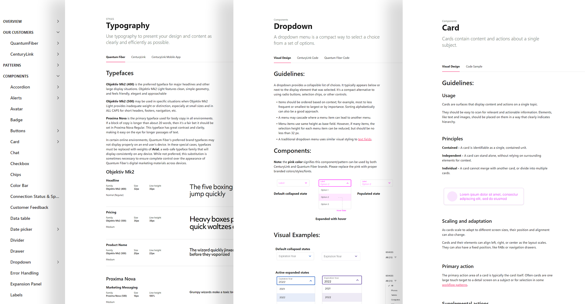
Our mandate was clear: develop a single, secure repository accessible to product owners, engineers, designers, and marketers. This system would not only store brand assets like iconography, color schemes, and typography but also house reusable UX/UI components, integrate with current tools (starting with Adobe XD and later Figma), and ideally support a design-to-code workflow.
Solution and Role
Our four-person design foundations team built a comprehensive design system that served both CenturyLink and Quantum Fiber brands. I contributed as an integral member, helping to establish and maintain a robust UX/UI framework featuring reusable styles, patterns, components, and icons - all supported by detailed online guidelines.
Process
Research and Planning:
We conducted interviews with stakeholders from design, engineering, and product management to understand user needs and pain points. Our analysis of existing UI components involved importing brand styles and UX guidelines into an online tool, capturing use cases and flows, gathering and organizing assets, and identifying refactoring opportunities and inconsistencies in current XD components.
Establishing Guidelines:
We defined a set of design principles aligned with the company’s brand identity and UX objectives. This foundation led to the creation of a dedicated, team-branded portal that centralized styles, flows, patterns, components, and other resources while standardizing terminology. We also refined component guidelines based on best practices from established design systems like Material.
Building the Design System:
Our team developed a reusable UI kit featuring components and patterns crafted for adaptability, accessibility, and responsiveness. A comprehensive style guide detailed typography, color schemes, iconography, and interactive elements, while thorough documentation explained the usage, variations, and implementation of each component.
New components and patterns were continually added to keep the system robust and current.

Tooling and Integration:
We selected tools that seamlessly integrated with our existing tech stack and facilitated developer adoption. A version control system managed system updates, and platforms like Zeroheight were leveraged to streamline the design system’s management and integration.
Training and Adoption:
Workshops and training sessions were conducted to familiarize designers and developers with the design system. An internal portal provided easy access to resources, and we established measurable goals to ensure smooth adoption while demonstrating the XD libraries and online guidelines.
Feedback Loop:
A continuous feedback mechanism was established to ensure the design system evolved alongside changing requirements. Regular updates and refinements were released, and enhancements were actively communicated via internal channels to promote ongoing engagement and consistency.
Results
The new design system dramatically improved UX consistency and enhanced overall brand perception, while cutting design and development time by 30%. Its scalable nature enabled the rapid rollout of new features and products.
Ultimately, this transformative initiative not only streamlined operations and boosted user satisfaction but also fostered a collaborative culture across teams—achieving full adoption within the UX/UI team and earning a 4+ star rating for usefulness.